Category Archives: Still Life

Magna Beer – Water Shoot

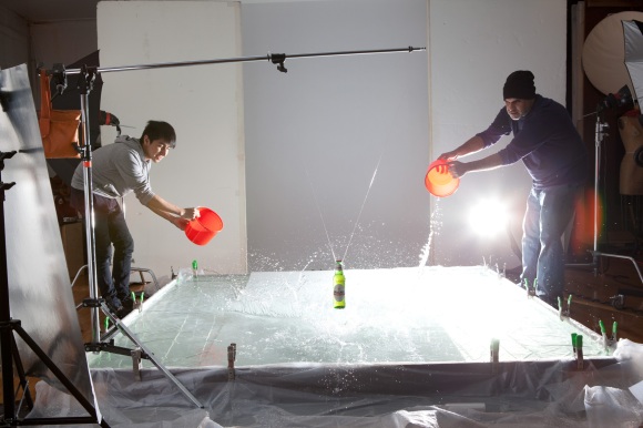
So I don’t think I’ve ever grown up.  I mean, really…still playing in a pool of water only a few inches deep…makes you think back to that little plastic pool you had as a kid.  What can I say, water is fun to shoot…in and around, if a little messy.  I had my two compatriots, Henry Alvarez and Jesus Baez with me to create some great beer advertising imagery.  This is not a project you can do alone.  It requires teamwork.

The idea was simple:

1. Go to Home Depot and buy new Drill!! (been looking for an excuse for that). Love me some Makita.
2. Create big pool enclosure out of 1’x6’s reinforced by 2’x4′ pieces at the corners. Make sure to screw from the inside out or risk the screw going to deep and puncturing a hole in your enclosure…
2. Fill pool with water(and hope it doesn’t leak).  For this, I bought a 10’x25′ 6 mil drop cloth that I doubled, so that, effectively, you get 2-6mil plys for your waterproofing.
3. Set up boom and tie off beer bottle to it via fishing line.
4. Light it and throw water at it and me until the perfect capture is made…

So is this work or play??  Play was definitely in the shooting…work was most CERTAINLY the cleanup…hand bailing out of 400 gallons + of water isn’t good for the back. 🙂

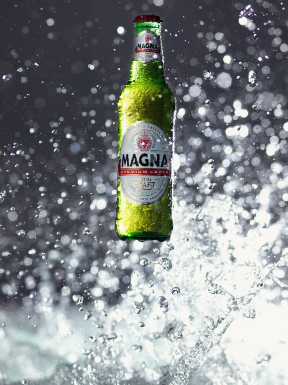
So here’s the money shot.  Click the image to see it bigger…you can see more detail in the larger pic.

The pool was 8′ x 8′, and the bottle was set near the front of the pool.  I believe the f/stop was 4.8, which allowed a nice depth of field behind the bottle for the water droplets to go in and out of focus based on how far from the camera they were.

Here’s a closeup shot.  Strangely enough, all the best shots came when the camera and I got wet as well…gotta take one for the team sometimes. 😉

…and the team that helped create it(below).
Jesus Baez on the left and Henry Alvarez on the right.  I’d like to thank both of them again for their help and hard work, especially on breaking down the set and draining the lake…not fun…

I may post a little video later of us doing the shoot, but I’ve got no time to edit the video now…so we’ll see about that later…til next time…

Thanks for viewing,
James

Tagged , , , , , , , , , ,

The Kanji Cosmetics Project – Skin’s Signs

Late last year, I had a wonderful collaboration with two amazing artists on a very interesting, conceptual still life project.  We started the project with seven kanji signs: Love, Life, Harmony, Dream, Happiness, Flower, and Strength.  The idea was to create these signs using cosmetics in an interesting, visual way.  The thing I liked most about this project was the complete creative freedom that was given to us by Hea7en Magazine, where it was run.

I almost didn’t take this on as the actual doing, writing, creating of the kanji symbols in cosmetics to me was very daunting.  In comes my savior, Moani Lee.  Aside from being an amazing makeup artist, Moani also brought to the table the ability to write/create the kanji symbols.  As this is a beauty cosmetics story, I would need someone that really knew the cosmetics and how they interacted with each other.  A story board might also be nice…Problem solved.  Moani came through on all fronts.  She story boarded the project, which was genius….and we got started.

Moani and I got together and went shopping for the accessories that we needed down the street in the Flower District of New York.  I love having that street so near to me as it provides so many great props for shooting different genres.  So we walked out of the store with about $50 in props, that on another day, wouldn’t have caught your gaze, but I knew they would be perfect for our shoot.  So while Moani worked on creating the cosmetic art for me to shoot, I worked on lighting the scene so that each one would have it’s own look and feel.

The last piece of the puzzle was the graphic design work.  We wanted something on the opposite page that reflected what the kanji symbol looked like, but we didn’t know where to go or how to do it.  Enter, David H…

David is an incredible graphic artist.  He took to the project head on and created seven beautiful kanji masterpieces for us to use opposite the photography.
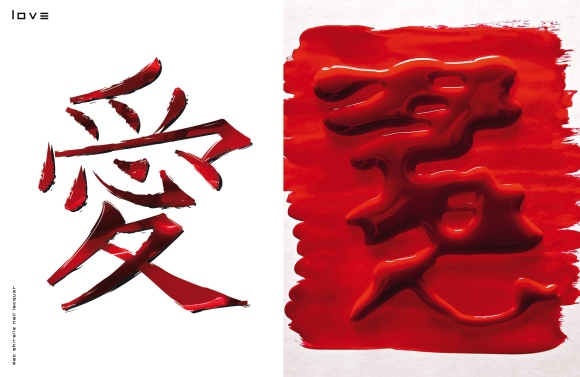
MAC Shirelle Nail Laquer

It’s a tough call, but I think “Love” was my favorite.  It just pops off the page visually.  This isn’t a digital creation.  Moani created the base symbol out of glue, let it dry, then “wrote” on top of it with the nail laquer so that it would be raised higher.  The higher it was, the better for me to light it and get the three dimensional look I was going for.
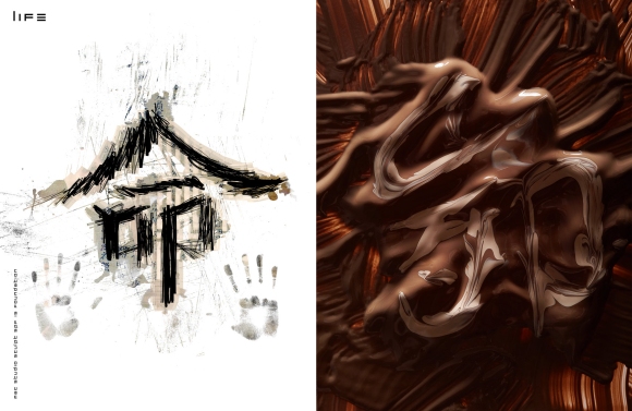
MAC Studio Sculpt SPF 15 Foundation.

Here’s, “Life”, aka “Sexual Chocolate”.  If this wasn’t foundation, I’d think it was pudding that I should dive into and love. 🙂
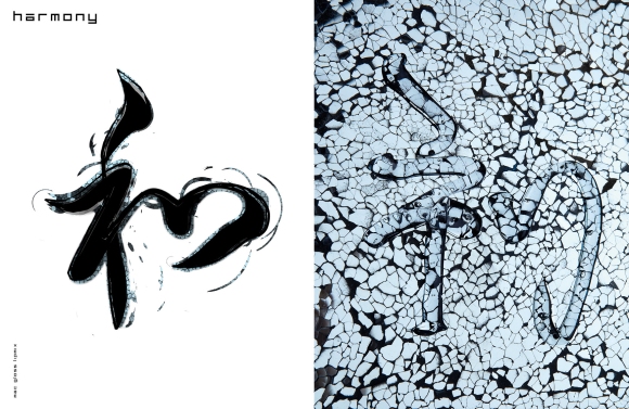
Mac Gloss Lipmix

I Ioved,  “Harmony”, but it was a hell of a lighting challenge.  How do you light something that’s clear and put directly on a mirror?  Very carefully…I probably took the most time shooting this one as it wasn’t an easy light.  In the end, though, I loved the outcome.

MAC Iridescent Powder  / Loose in Golden Bronze mixed with MAC Matte (Creme Matifiante)
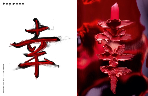
MAC Baby’s on Fire (Dazzle) Lipstick.

Photographically, this is the one that I had the most fun with.  The base that it’s sitting on is this silver dish shaped like a leaf.  Obviously it reflected everything, so I thought to put a red gel over the top of me so that it would warm up the entire photo.  You can actually still see my hand near the top left third of the photo.  Distorted, yes, but still there..
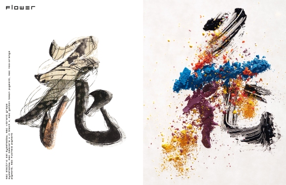
MAC Electric Eel Eyeshadow / MAC Vibrant Grape Eyeshadow / MAC Mascara in Black / MAC Golden Lemon Pigment / MAC Neo Orange Pigment / MAC Fuchsia Pigment.

Flower was a real challenge for Moani as it had to be built upon and you can’t really clean it up if you make a mistake.  She did a wonderful job adding in all of the different colors and making this symbol.
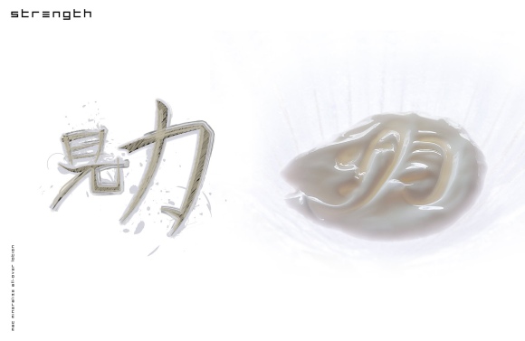
MAC Mineralize All-Over Lotion

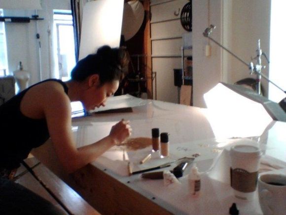
Here’s Moani working on “Life”, or as we nicknamed it, “Sexual Chocolate”. 🙂

Me downloading the images manually as the tether decided not to work that day…I dunno, would you trust this guy?   😉
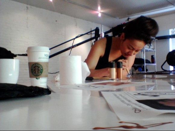
On the right, in the foreground you can see a little bit of, “dream” and a nice closeup of the coffee that fueled us…

It turned out to be a fun, creative day.  I’d love to give props to my two partners in crime here, Moani Lee and David H for making this a wonderful story.

Special thanks to Joe Lombardo for bringing this story to Moani and I to shoot.  He was the catalyst that brought all of us together and got the creative spark going.  He’s also the photographer for the wonderful behind the scenes images you see here.

THE Team:
Photography: James Weber
Makeup/Styling/Story Boarding:  Moani Lee, www.moanilee.com
Graphic Artistry/Layout/Design: David H,

Retouching:  La Boutique Creative Retouching, http://www.laboutiqueny.com These guys did an amazing job,  I’d highly recommend them.  They’re a very professional organization.

Hea7en Magazine Issue 4
:  There are many other wonderful artists here in this issue.  I was kind a blown away when I first saw it.  It’s art and photography rolled into one..

Thanks and see you again next time…

Tagged , , , , , , , , ,

Portillo Wine Ad Campaign

I’ve teamed up again with Creative Director, Henry Alvarez on the new campaign for Portillo Wines.  It’s always good to know the agency point of view, so I asked him, “From a branding point of view, what did you want to accomplish for Portillo with this ad?  What was the Client looking for?”

Henry: “We wanted an image with strong appetite appeal as well as create a mood and atmosphere that would bring an elegance to the dining experience.  Our assignment was to connect Portillo Malbec with steak. We played back and forth with a strong tagline. We finally arrived at “A Cut Above the Rest”.  Once done we ended up with a strong consumer Point of Sale campaign that elevated the brand.” 

The shots we needed were broken down into three individual images, which would then be combined to make the different creatives needed.

1. Shoot the wine bottle alone and the wine glass alone.  That would go towards the first creative.
2.  Shoot the food + wine glass, then add in the wine bottle shot in #1, which would go towards the second creative. The shots would all be used in a mix of website use and advertising formats.

So here is the first creative, made up of the bottle and wine glass separately and put together in post.  There would be no way to light both of them together and achieve this same result, thus the decision to shoot each of them separately.

So here was the set for the bottle shot.  The main light is coming from 2 strobes with reflectors shooting through the 4’x8′ plexi on the left hand side.  This softens up the light so that the rich detail in the label doesn’t get blown out.  The reflection on the right is created by the silver card on the right, sitting on the table.  The two reflections running up and down both sides of the bottle are created by the soft boxes in the back facing in.  Lastly, I’ve got one more light on the floor with a beauty dish + grid hitting the backdrop so that there is some separation from the background.  Below is the shot.

The individual wine glass shot I don’t actually have a behind the scenes photo of.  I had to create a totally black room out of black v-flats.  The only area for light the was possible was from the back side where I had the 4’x6′ feathered off.  It was a one softbox shot.  Getting the angle right was the hardest on this one so that there was a nice reflection on both sides of the glass and the wine showed up just enough.  I fired the camera remotely so that I wouldn’t be in the reflection.  It was much more to setup than to actually shoot.  We did have to do a little post on the glass as even as much as we tried to clean it, there was still a little dust here and there.

Here is the version with the Argentinian Steak.  Although I don’t have a behind the scenes for this one, I used Dedo Lights to do the job on this one instead of strobe. They allowed me to spotlight what I needed and provide a low depth of field.

A little about the wine and the region…click the image to see it larger.

So that’s it for now…stay tuned for more…

Thanks to the Team:

Photography: James Weber, www.jamesweberstudio.com
Creative Director, Henry Alvarez
Food Styling: Ed Gabriels, www.halleyresources.com
First Assistant:  James Sullivan

Tagged , , , , , , , , , , ,

Agave Love

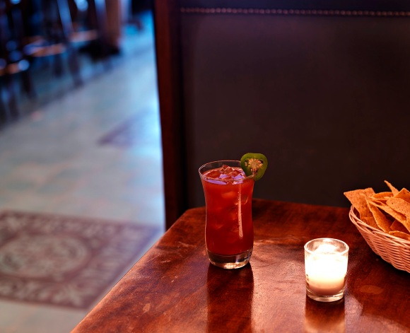
“Para todo mal, Mezcal y para todo bien también”  For everything bad, Mezcal, and for everything good, too…or so the saying goes in Oaxaca, Mexico where Mezcal is made.

I thought I’d share some of the work I’ve done  for Los Amantes Mezcal this year.  Most recently, I shot some images for a recipe book they’re working on at Casa Mezcal, a wonderful bar on Orchard St.

This is the first ad that I did for Los Amantes Mezcal, earlier in the year.   We were going for a very traditional look.  I ended up doing a long exposure to get the candles and ambient light in the shot.  I also did a little painted light using a flashlight on the bottle itself to lighten it up.  This was all set up in my studio.  All the post production and creative direction was done by Henry Alvarez.


Los Amantes did a label redesign, and thus needed the bottle shot for their new ad.  This has to be one of the hardest still life projects I’ve taken on recently.  The bottle itself has a lot of details that had to be lit, but it couldn’t be “too lit”.  If I lit it from underneath, the bottom of the bottle wouldn’t have the three dimensionality that it has and it would have lost a lot of it’s character.  The color of the liquid had to be just right as well.  So…this was probably a 4-5 hour session for this single shot.  Glass reflects everything so it just takes time and care to work through all the little details of it.  I like the moody feel that Henry and I ended up with.  I feel it gives the bottle some nice character.

Ahh, but what can you do with this wonderful liquid??

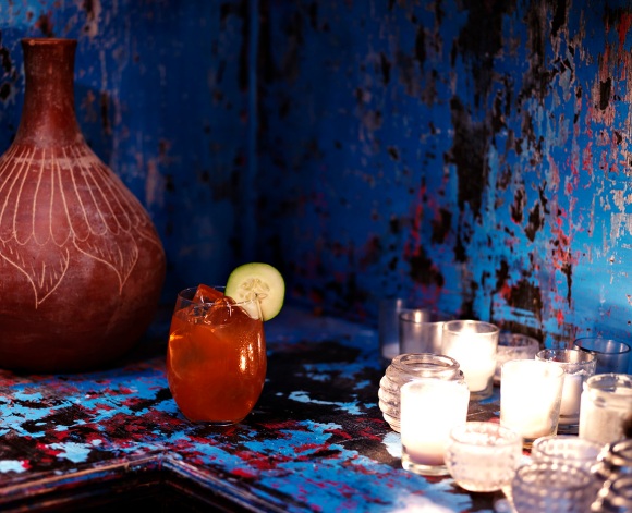
I’m here to help out. 🙂  I recently shot the images below for a Los Amantes recipe book.  So I fully expect you all to try at least one of these…
They were all shot at about 2 seconds each on tripod to get the ambient light and added some hot lights for an accent light.  So you can try to make these yourself, or if that’s too much trouble, you can go to the bar where these were shot at:

Casa Mezcal
86 Orchard St
NYC, NY 10002

“The Mezcal Margarita (or Mezcalita)”
2 oz of Los Amantes Joven
1.5 oz of Orange Cognac Liqueur (such as Bauchant)
1.5 oz of Fresh Lime Juice
1 oz of Agave (or simple syrup)
Salted rim optional
Combine all ingredients over rocks, shake and serve in a coup glass, preferably frosted.


“The Pianissimo”
1 oz Los Amantes Joven
1 oz Aperol
1 oz Pineapple Juice
¼ oz Agave (or simple syrup)
¼ oz Fresh Lemon Juice
5 Cucumber slices
Muddle 4 Cucumber slices with agave and fresh lemon juice, add all other
ingredients and ice, shake, strain and serve on the rocks in a tumbler with a
cucumber garnish.


“Pedroʼs Basilica”
1 ½ oz of Los Amantes Joven
¾ oz St. Germain Elderflower Liqueur
¾ oz of Fresh Lime Juice
½ oz of Fresh Pineapple Juice
¼ oz of Agave Nectar
Several leaves of Basil (including one small one for garnish)
Several slices of half a Fresh Yellow Bell Pepper
Muddle the basil and pepper slices with Agave and Lime Juice, add ice and other
ingredients, shake, strain into a cocktail glass. Garnish with the small basil leaf
after slapping it between your hands to release the essential oils in a cocktail
glass.


“The Bloody Mez”
2 oz of Los Amantes Joven
5 oz of Fresh Sangrita, recipe to follow (or substitute fresh Bloody Mary mix)
Lime Wedge or Jalapeno slice for rim garnish
For the Sangrita:
3 oz tomato juice
2 oz fresh orange juice
Squeeze of lime juice
Dash of Mexican hot sauce (or Tobasco)
Dash of Worchester sauce
Pinch of celery salt
Pinch of regular salt
Several slices of a piquillo pepper (or Anaheim chile, or jalapeno),
muddled
Mix all ingredients together and shake well before combining with mezcal
Pour all ingredients together over rocks and serve in a pint glass or highball.


“Relax on the Rocks or Sip it Straight”
These two are unmixed drinks
1 simple glass of Los Amantes Joven neat with a lime slice garnish
1 simple glass of Los Amantes Reposato on the rocks (preferably one big rock, like they do at
Scotch bars) rimmed with gusano (ground, roasted worm salt)


“The Palomez”
2 oz Los Amantes Joven
1 oz Fresh Ruby Red Grapefruit Juice
½ oz Fresh Lime Juice
½ oz Agave Nectar (or simple syrup)
Splash of Soda Water
Optional salt rim
Combine all ingredients over ice, stir, add splash of soda and serve with lime
wedge garnish in a highball.

Tagged , , , , , , ,

New Water Still Life

I’ve started a new project based around Still Life and Fragrance specifically. While in this project, I’m not necessarily shooting the bottles for the brand, I’m exploring creatively what I can do with light, shadow, and sets to create unique visuals that showcase the beauty of the bottles in those environments.

Usually, the fragrance bottle gets shot on white or black and then cut out and put on some lifestyle image that represents what the brand is going for. Photographically and creatively, I think this approach falls short. This works and does convey the brand’s message, but I feel that they spend so much time and money creating these beautiful bottles for the fragrance, that the photograph of the bottle ends up being an uninspiring secondary visual.

My goal in this project is to find unique ways of shooting and showing off the bottles in an environment either natural or a set built for it. I think that if I let the background show through and let the bottle become a part of it’s evironment, then it will become a more interesting visual that the usual boring cutout…

Gucci’s Flora:
The fun part about Flora is that the bottle has a unique shape and takes on whatever colors you put behind it. For a subject it’s great as you can really do anything with it. I have an empty 110 gallon fish tank that is not being used right now, so I thought I’d have some fun with water drops. It’s all timing and lighting here. I think it took about 40 drops before before I got just the right angle and bubbles. You can never go wrong with water and still life. Every shot is unique and can never really be recreated, so you just have to limit the factors that could make for a bad shot and have great timing to catch it.


Marc Jacobs’ Daisy:
I took some artistic license with this one as the bottle has some very unique white flowers on top of the bottle. I knew that if it were backlit, it would create a very dramatic silhouette, while lighting the bottle’s distinctive yellow liquid and branding. Part of creating the look was using a snoot to spotlight just the bottle so that the light dropped off dramatically on the right, silhouetted the rocks and top of the bottle. I left the bubbles on the flowers intentionally as I thought it added something unique to the shot.


More to come…up next Givenchy and Escada’s Ocean Lounge.

Tagged , , , , , , , , , , ,

Water Sets…small and large.

“WATER SETS, LARGE AND SMALL”
(You can click any image below to see a larger version)

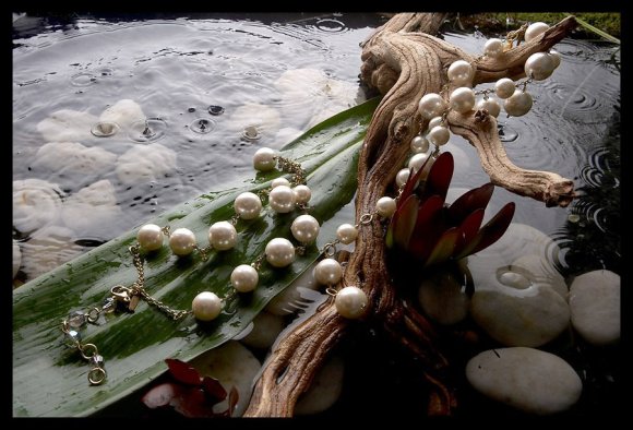
I thought I’d pass along a little of how I arrive at deciding to build certain sets. I’m a firm believer that if you think it(and it’s reasonable), anything is possible. The building blocks of this are material cost, space, time, and man(or woman) power. If you have all four, you can create anything your heart desires. Sometimes we have the space and time, people to create, but money becomes an issue. This should never stop creation, it should spur invention… This first set is born of a collaboration between myself and Jersey(stylist/set designer). Jersey and I have always worked well together in creative collaborations. We were given 2 six page spreads and told we had to have certain items in the shoot, but we could shoot it however we liked. I had wanted to do a water/nature shoot for a while, so we sat down and figured out the “how” of it. We had all of the required elements: Space(my studio), $$(relatively inexpensive), time and manpower were at hand as well. So the river/lake edge set was born.
This Project was built in a waterproof 4’x4′ enclosure that I made out of plywood and 2″x4″s. 1/2 of an old aerobed made the waterproofing for this one. It was sacrificed for the good of the project. 🙂Being on 28th St. between 7th and 8th avenue in Manhattan is a HUGE benefit to shooting Still Life. The Flower District is only one street over between 6th and 7th. If there’s a rock, tree, stump, or exotic flower that I need, it’s in one of the shops down the street. We went shopping for 4 different kinds of rocks/shale and a variety of vegetation that would give our set the look of a beautiful water paradise. We shot this over 2 VERY long days. Going from set to set took a while to break down and build up, but we both enjoy the building/creative process, so it was more fun that work. Especially when we saw the results of the work, we were very pleased. This was the one and only “dry” set shot. The look of the Sun in the background, for those interested in technical details were 2 bare bulb Profoto heads firing at full power on their own packs. I used this a few times during the shoot to simulate daylight shining through the vegetation. There were some outtakes and things we tried, but ultimately got left on the cutting room floor. I had this idea that dry ice would make for a bog-like place(think Empire Strikes Back with Yoda). Unfortunately, the dry ice just didn’t work in well with the other sets to make the story Gel together. Trust me…I’ll find a use for the dry ice yet. 🙂 Sooo…it got cut. But dry ice IS fun. 🙂

That’s me having fun with the dry ice. Very Yoda in Empire Strikes Back, No? Jersey working on jewelry placement.

The final result…with raindrops added by spashing from the sides and a high shutter speed to capture the “stop action”.

So I was thinking about what we accomplished with a 4’x4′ water set in studio… What if I could create a larger set with more water? Could I do a fashion shoot with men or women? The answer is an unequivocal YES. 🙂

For the next set…

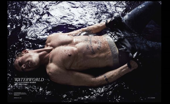
Zink Magazine was doing their first Men’s Issue scheduled for publication in April of 2009(shot in Dec 2008). I thought this was the PERFECT time to try out my “human” water set theory. The product set above got me to thinking that it was possible to do this larger set in studio. It was December and really cold, so doing anything outside on the roof was completely out of the question. In Studio was the only way…I went to the hardware store and bought enough 2″x6″ boards to creat a 12’x12′ enclosure. I made sure that they had enough screws in them during construction that they would not break under the pressure of about 400 gallons of water that would eventually be in the enclosure. Then Costco comes into play with the 2 – 20’x20′ waterproof tarps that I used to waterproof the enclosure. I really had NO idea prior to doing this shoot whether the tarps would be completely waterproof. The box said water resistant. wow…this could be REALLY BAD. I was fairly sure that it was, but only found out after the fact that it worked perfectly…lol. No worries…everything was fine. 🙂 I have to say that Jonathan, our model, was a trooper throughout the whole thing. Even with keeping the studio very warm in the air, it’s impossible to make 400 gallons of water warm. The first 30 or so was hot, and then it was just a losing battle. So Jonathan had to get brave the cold every outfit. It didn’t help that everyone was spashing cold water on him to give the shot movement. Other artists on set:
Kim Baker: Grooming
Roy Fire: Wardrobe Stylist
Vincent: Splasher, Art Direction.

Back to the set for a minute…here’s a shot of the set once I put up the background for the left photo(above). We could get most of the clothes wet, but there were some that we couldn’t, thus, I shot it within the set below. So that was the Zink shoot… The last water set is Very Small. I was shooting Diamond earbud covers for the classic white IPOD headphones. These were made out of pink diamonds and retailed for around $50,000. What celebrity wouldn’t want them?? 😉 This was shot in a little bowl, maybe 1/2 inch of water. I used some wax to keep them upright(standard for jewelry shoots). To get the movement of the water, I used a fan blowing softly. That’s all for now….

I have some more projects in the works that I’ll share when completed. You can see more of my work at: www.jamesweberstudio.com

Tagged , , , , , , , ,